Professional Squarespace Portfolio for Artist/Scientist Entrepreneur
ABOUT THE CLIENT
Alex Warneke
Alex found Carbon & Clay through Google, as many of our clients do. She needed a new website. She had already had a Squarespace website but was having a hard time making it look how she wanted it to look and finding the time to get it done in between all her client work.
Throughout her career, Alex has been a strong proponent of utilizing unconventional communication pathways – partnering with artists, scientists, and fellow change makers – to extend the impacts of science to a broader sphere of influence. Her work is amazing and we were so honored to be a small part of her entrepreneur journey.
Here's what Alex had to say about working with us:
“Thanks so much it all looks better than I could have imagined!”.
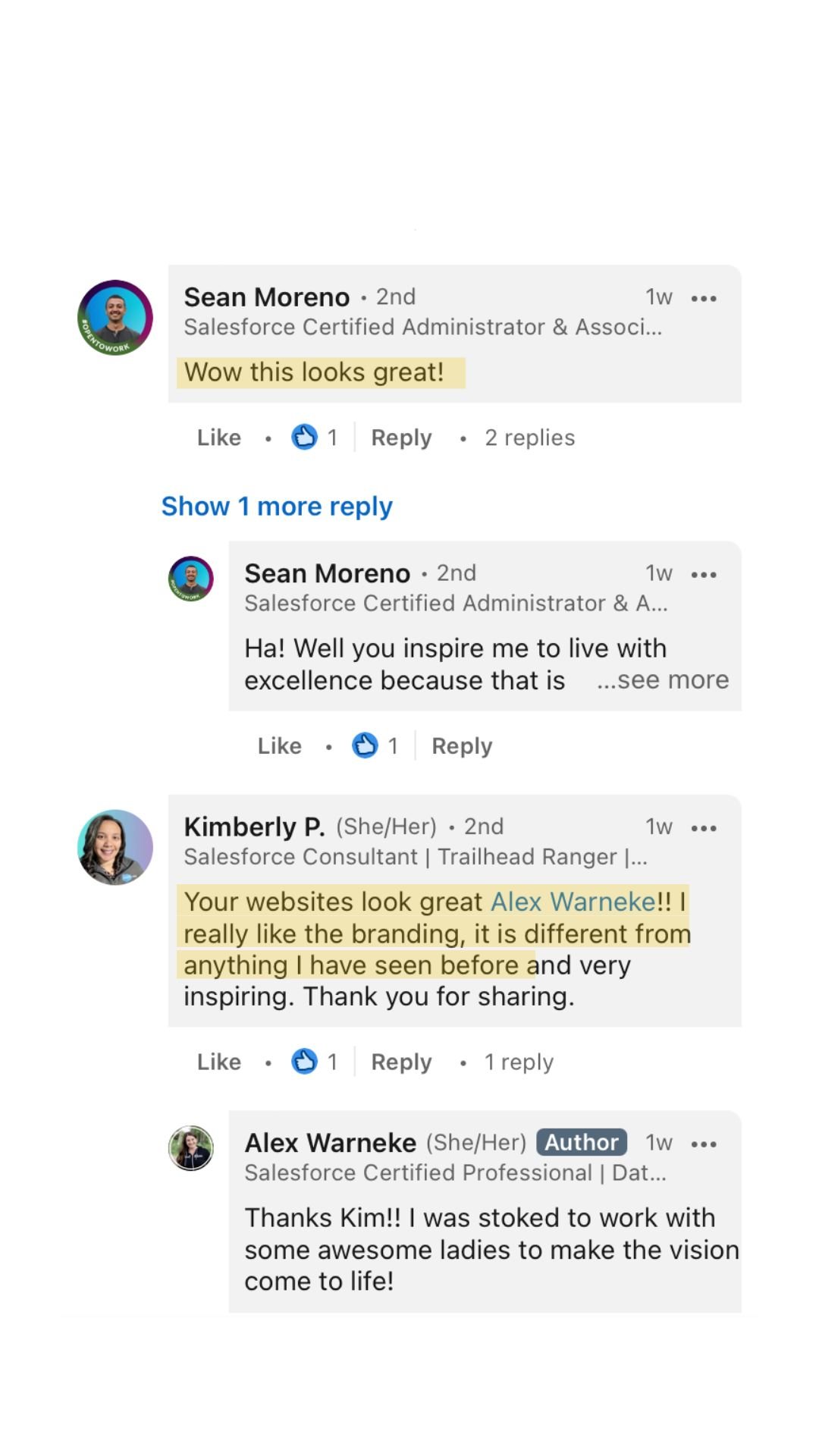
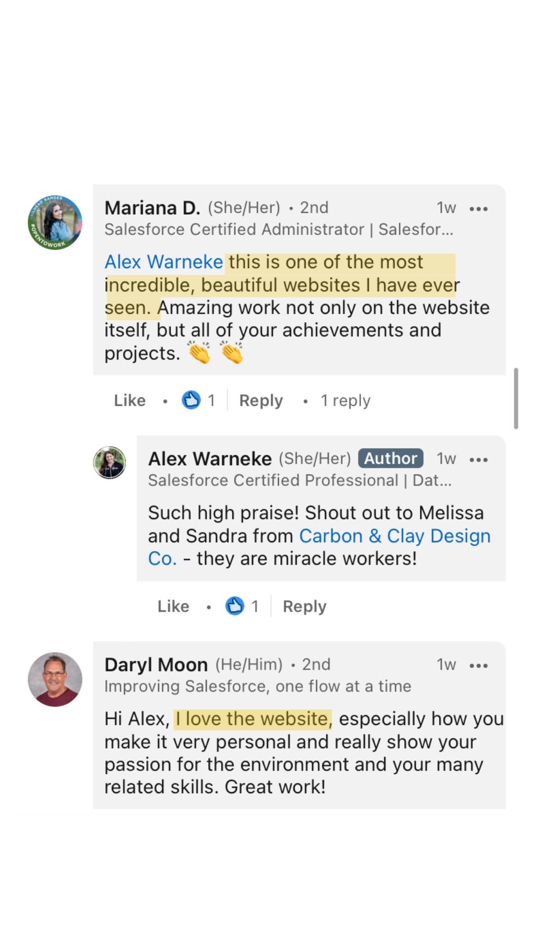
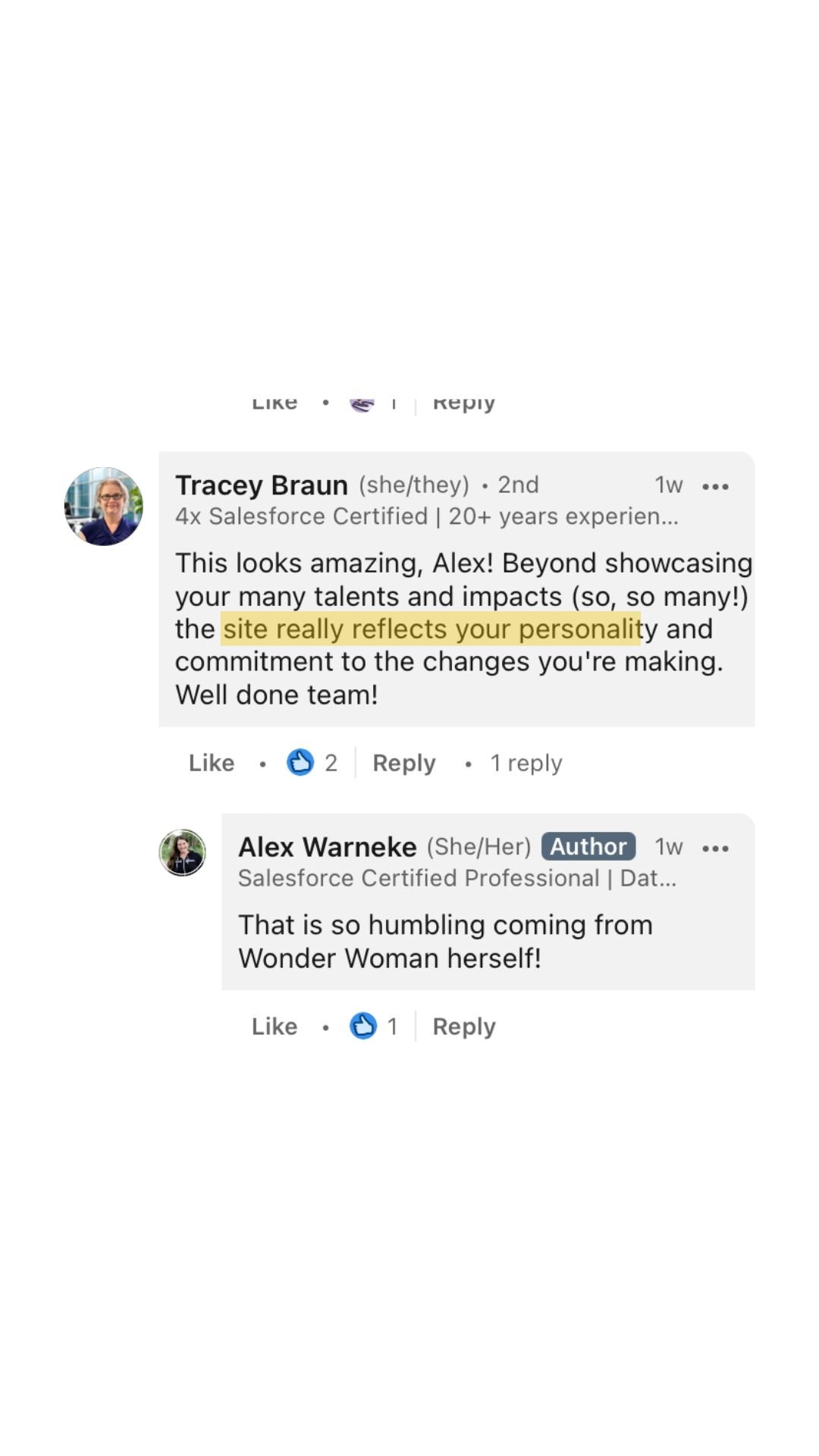
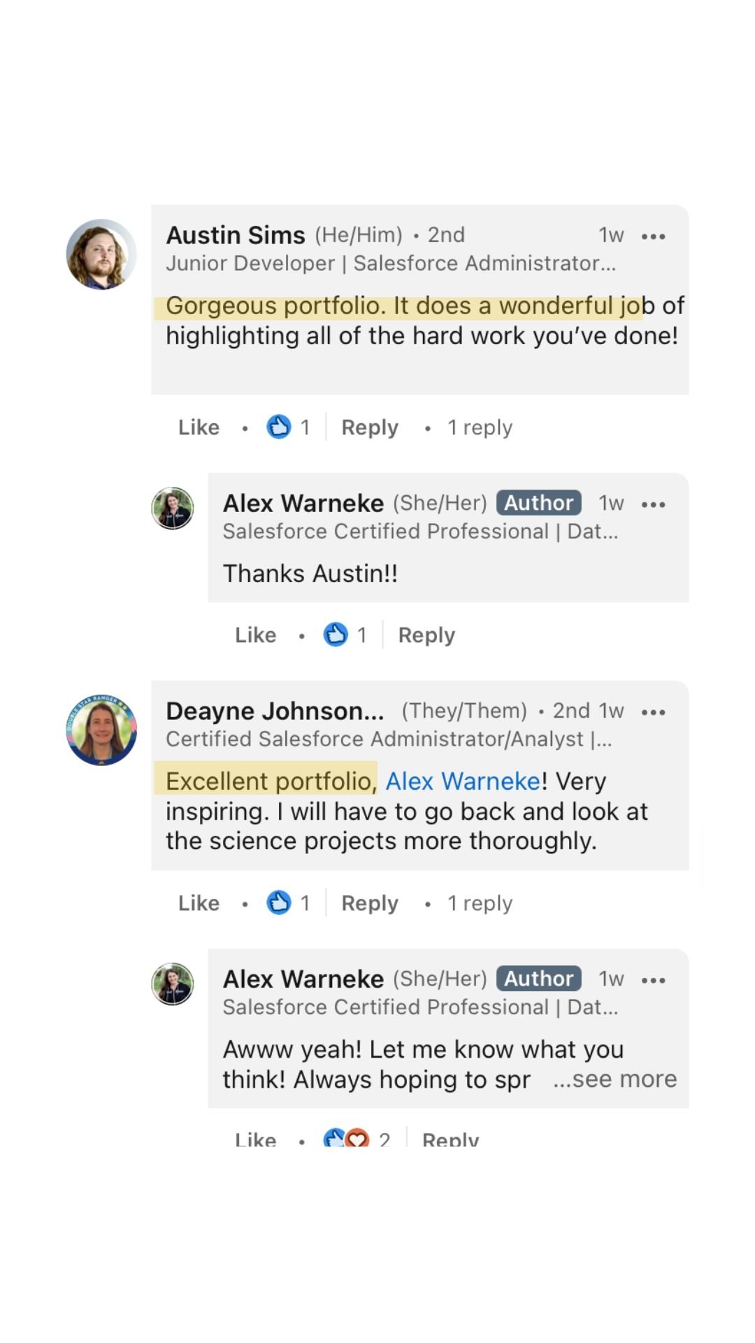
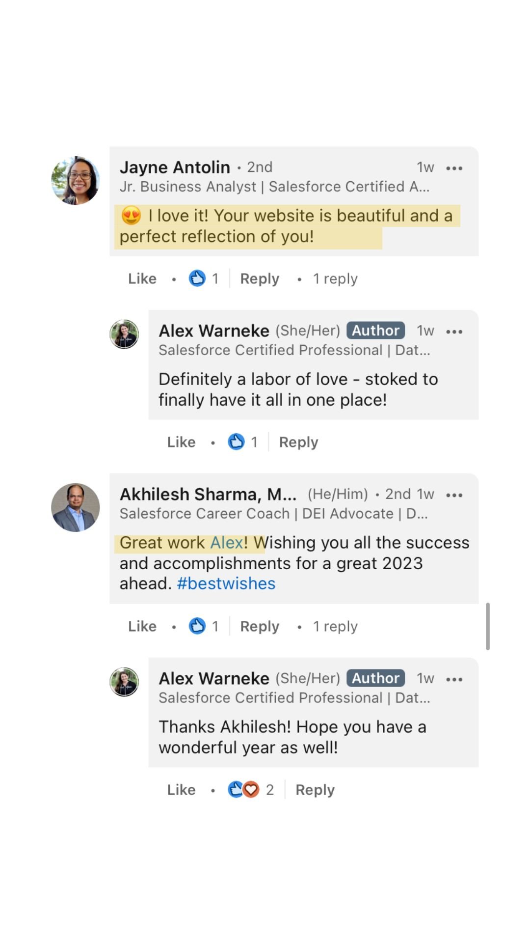
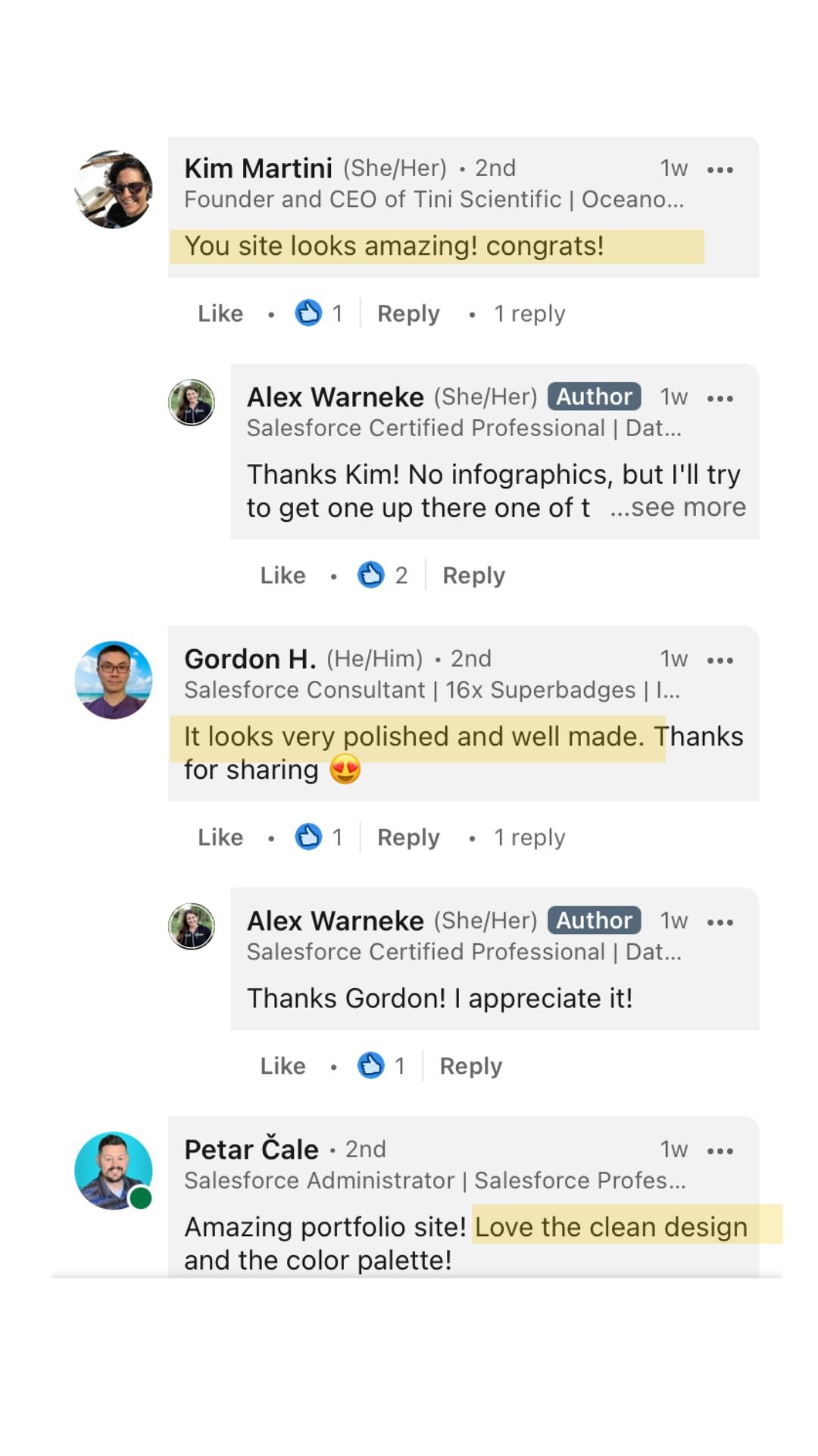
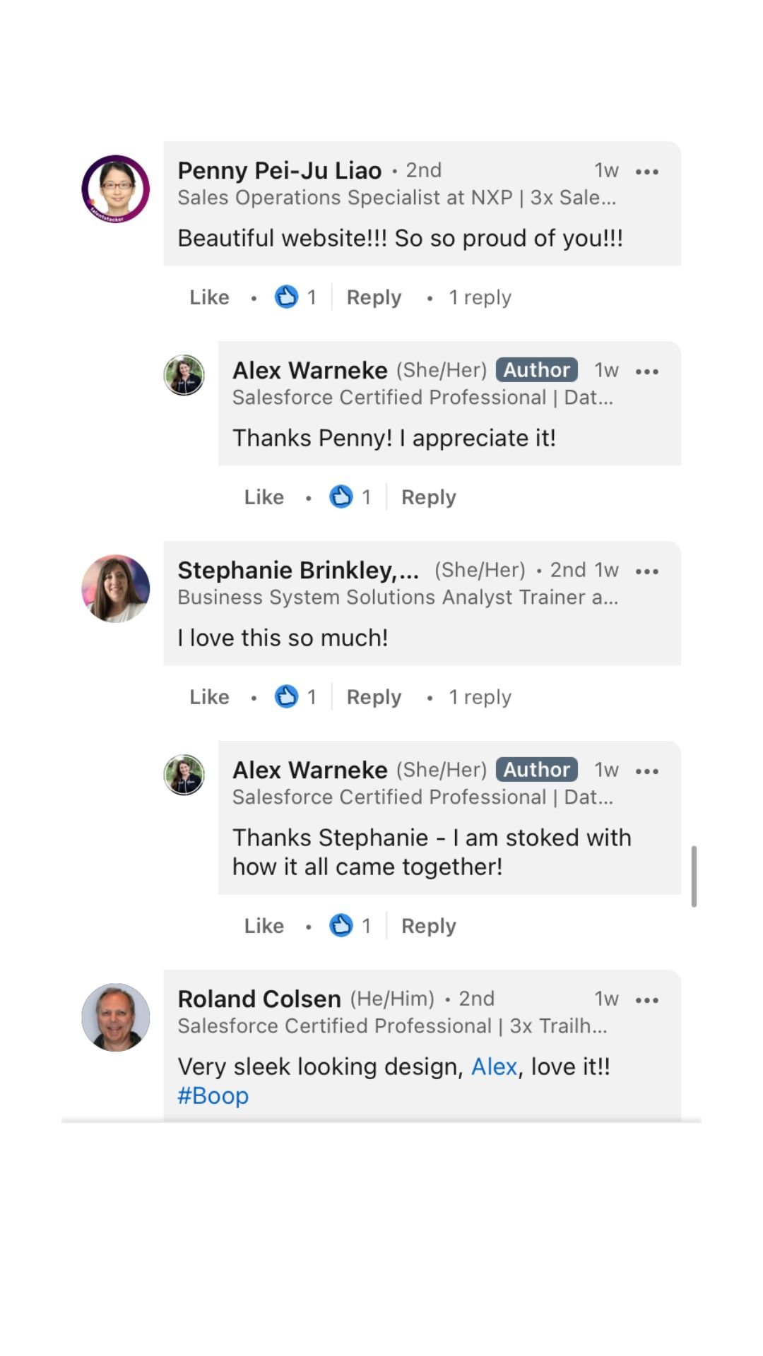
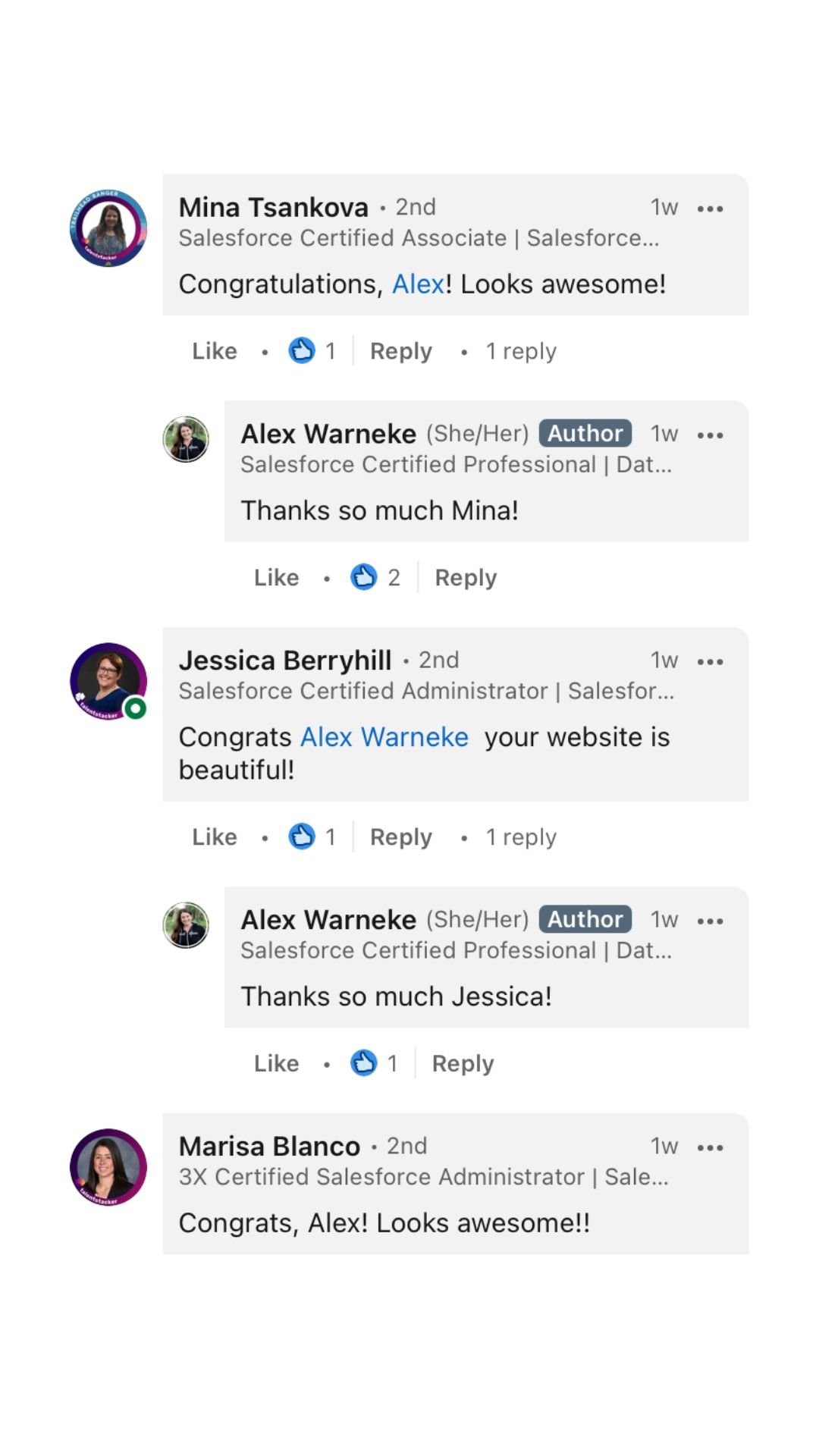
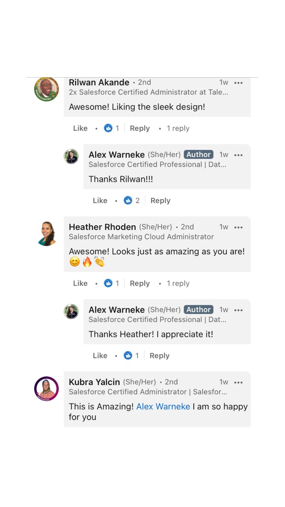
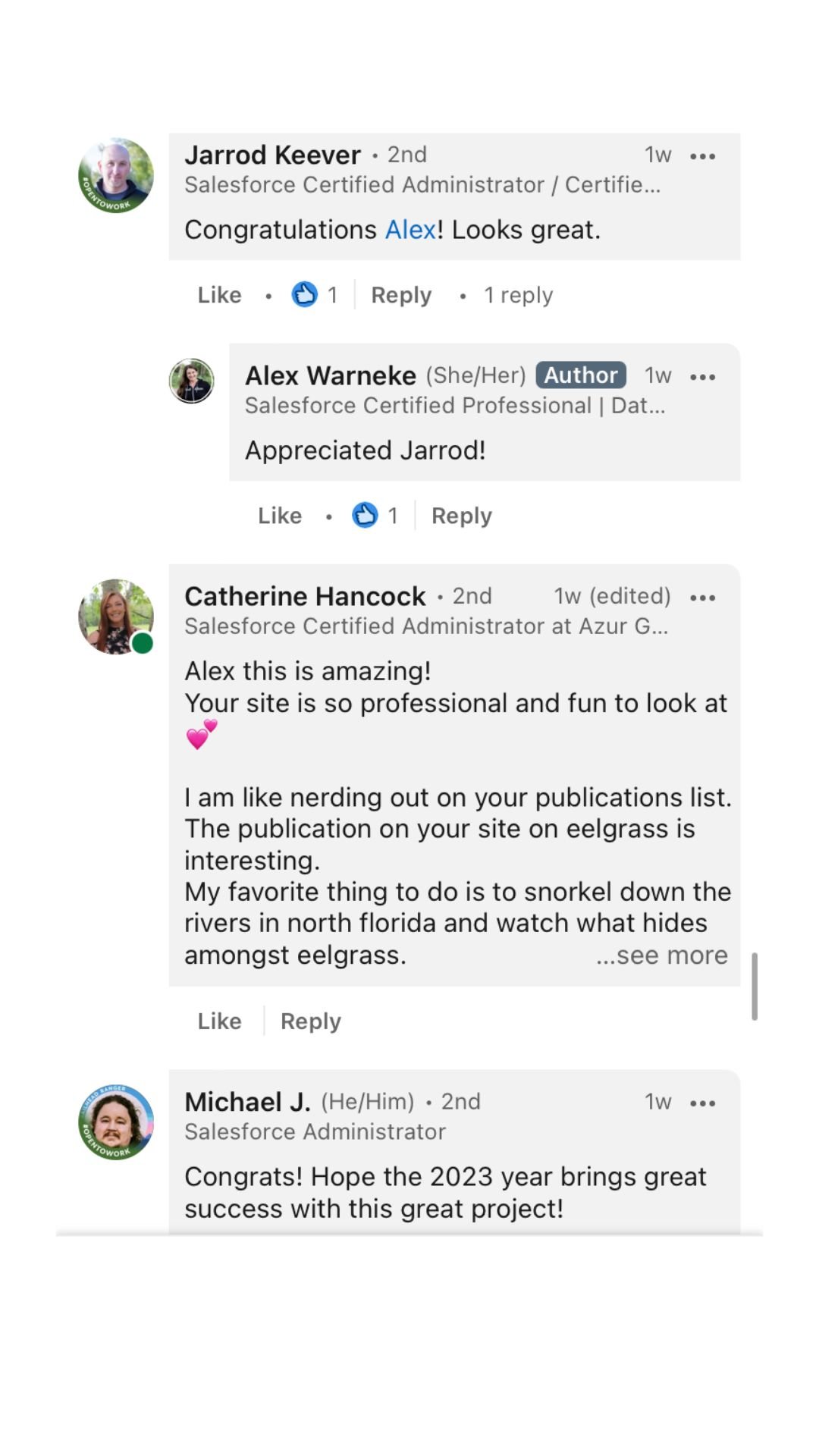
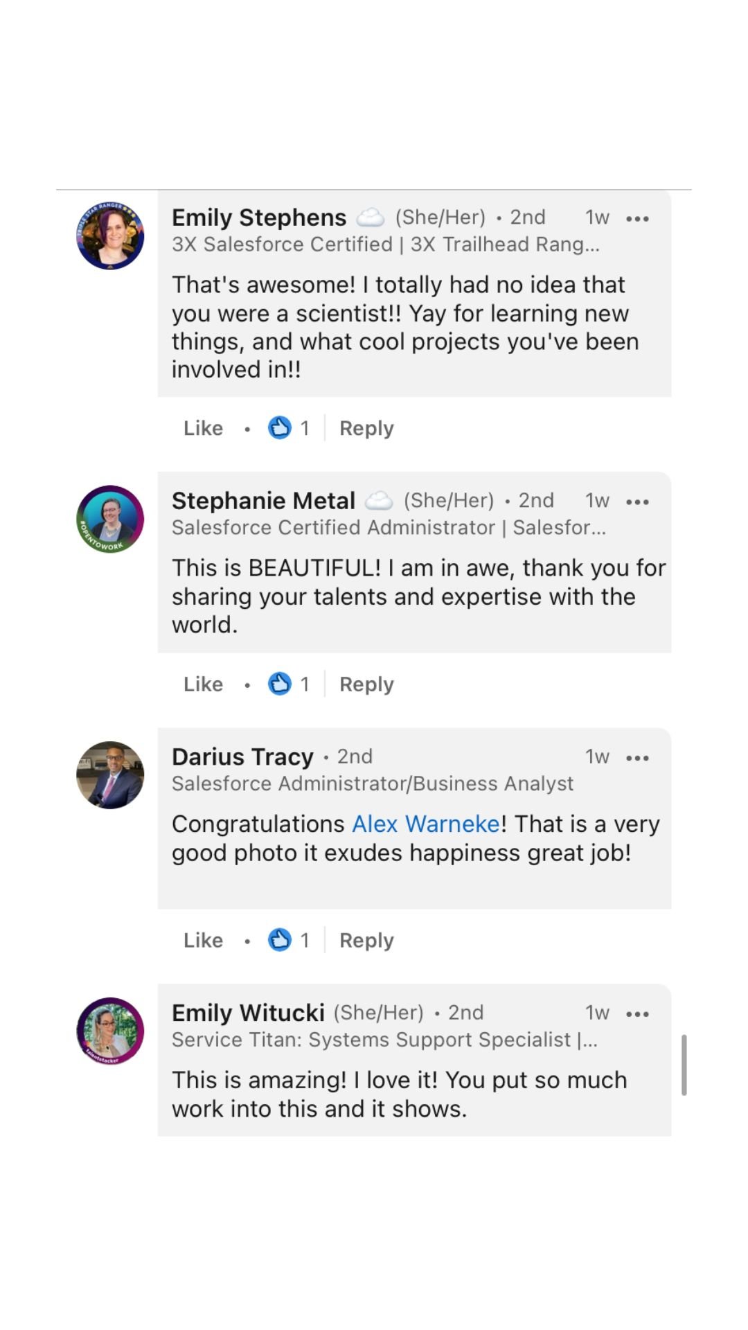
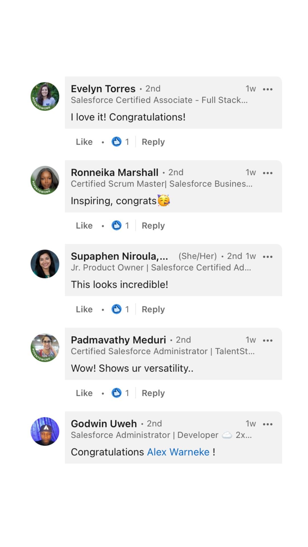
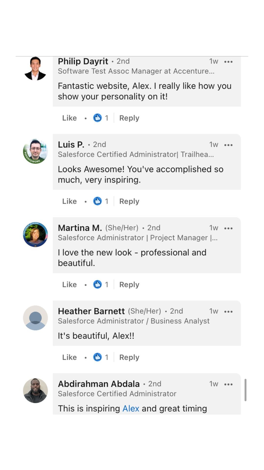
When she took the plunge and launched it she had HUNDREDS of comments from her peers on Linkedin telling her how professional it looked. It was so cool to see the reaction!
alex’s Final Website Design
ABOUT THE PROJECT
Alex wanted a website that looked unique and professional. We first started out with her brand. She had some inspiration images put together for us which made it really easy to see which direction she wanted to go. After creating her logo and curating her brand fonts and colors, we started redesigning one of our Squarespace templates to fit her new brand.
Instead of the original overlapping images from the template, we overlapped the image with some transparent triangles that are carried throughout her website to add some dimension and a customized look.
Alex had just gotten her brand photos done which really helped pull the whole website together.
Alex’s large and dynamic portfolio was a major piece to her website. Since she had art and science projects, we needed to find a way to organize them all clearly and make it user friendly for the end-user to view her work.
Alex was the dream client, always providing what we needed on time and delivering things in a super organized manner.
The end result is a website that looks nothing like the original Sand & Sun template and that portrays her work in a very professional yet memorable way.
Alex Warneke Homepage Design Based off of our Sand & Sun Template
see the final site below!
give your website url out with confidence
Shop our templates to create a professional looking site for a fraction of the cost! Or hire us to do it and have a launched site in just 5 days!

