Squarespace website for female business coach
Susan was in your shoes not too long ago.
She was overwhelmed with her brand and website and didn't know where to start.
She was referred to Carbon & Clay by someone and she actually began by purchasing one of our DIY Squarespace templates..
She quickly implemented the things she learned and went from having NO IDEA where to start... to knowing that she needed a brand that was down to earth, personable, professional, and optimistic.
But then it hit her...
How do I actually create a brand and website that feels like this?
So, she hoped on one of our live Q&A calls (included with every template purchase) to ask for some help.
And after giving it a try on her own for a while, she decided that her time could be better utilized if she were able to spend it working with clients and recording more podcasts or YouTube videos (ie. the things only SHE could do in her biz)... and let Carbon & Clay set up her template for her.
And here's what happened next...
We met on a quick Zoom consult and worked with her to create a plan for her site that gave her the dream website she wanted that fit every brand adjective described above... AND fit in her budget.
A custom proposal and invoice that she could easily sign and pay online was sent.
A homepage mockup design was reviewed on our first strategy call together.
We used the approved homepage mockup as the guidelines for her site build.
We created the draft of her site within 36 hours and sent her the site to review.
We tweaked and prepared the entire site for the launch date based on her feedback.
She paid a small amount upfront for her new site and can now launch a site she's proud of... without the fear of draining the bank or having to do it all on her own.
And ALL of this was done in just 5 days flat!
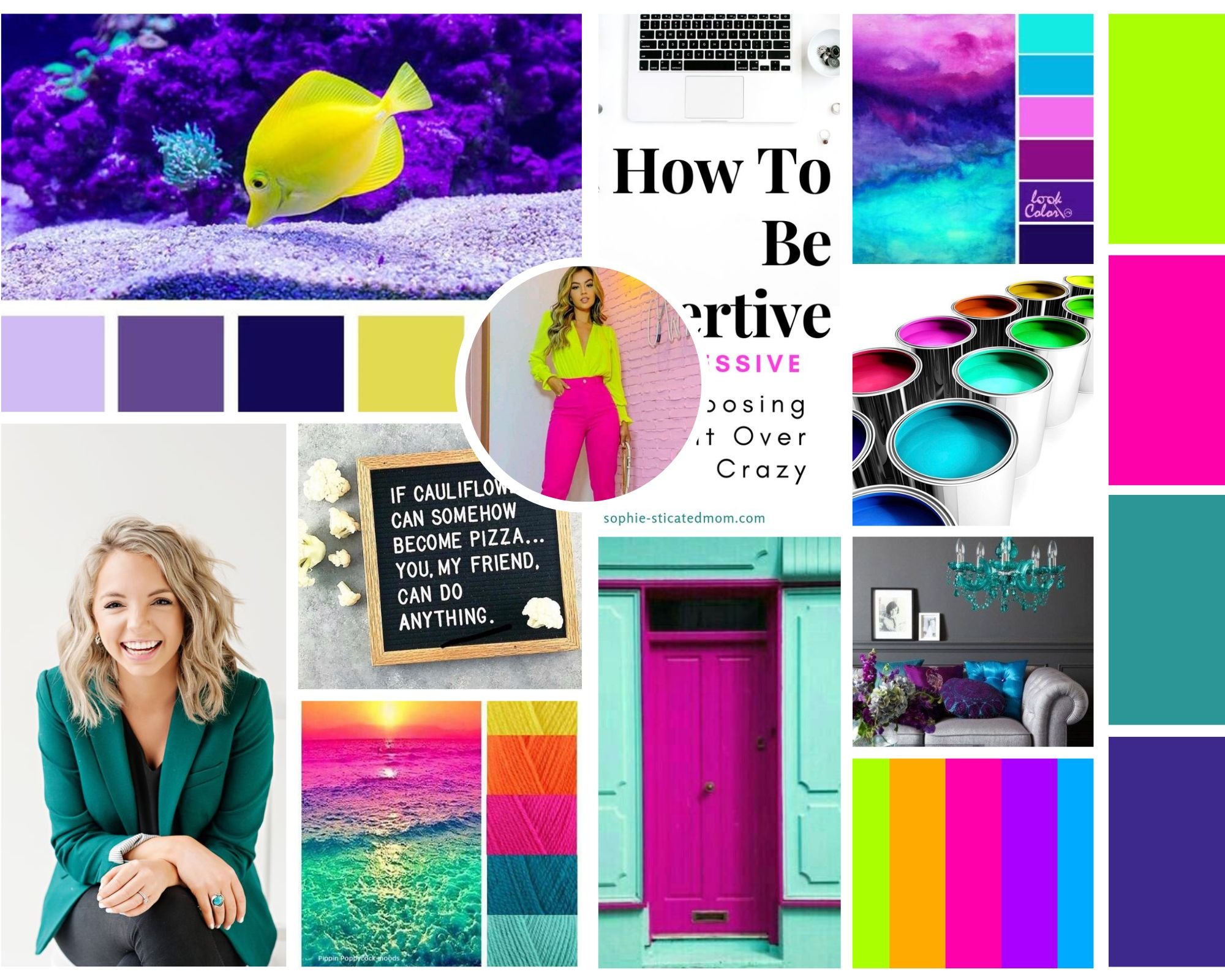
Here's the mood board Susan created for her business using our DIY brand course that comes with all of our templates.
As you can see, she wanted something super bright, vibrant, and fun... but also wanted a site that felt professional and optimistic. We had the opportunity to figure out how to pair these adjectives together in a site that would showcase her expertise and boost her credibility online.
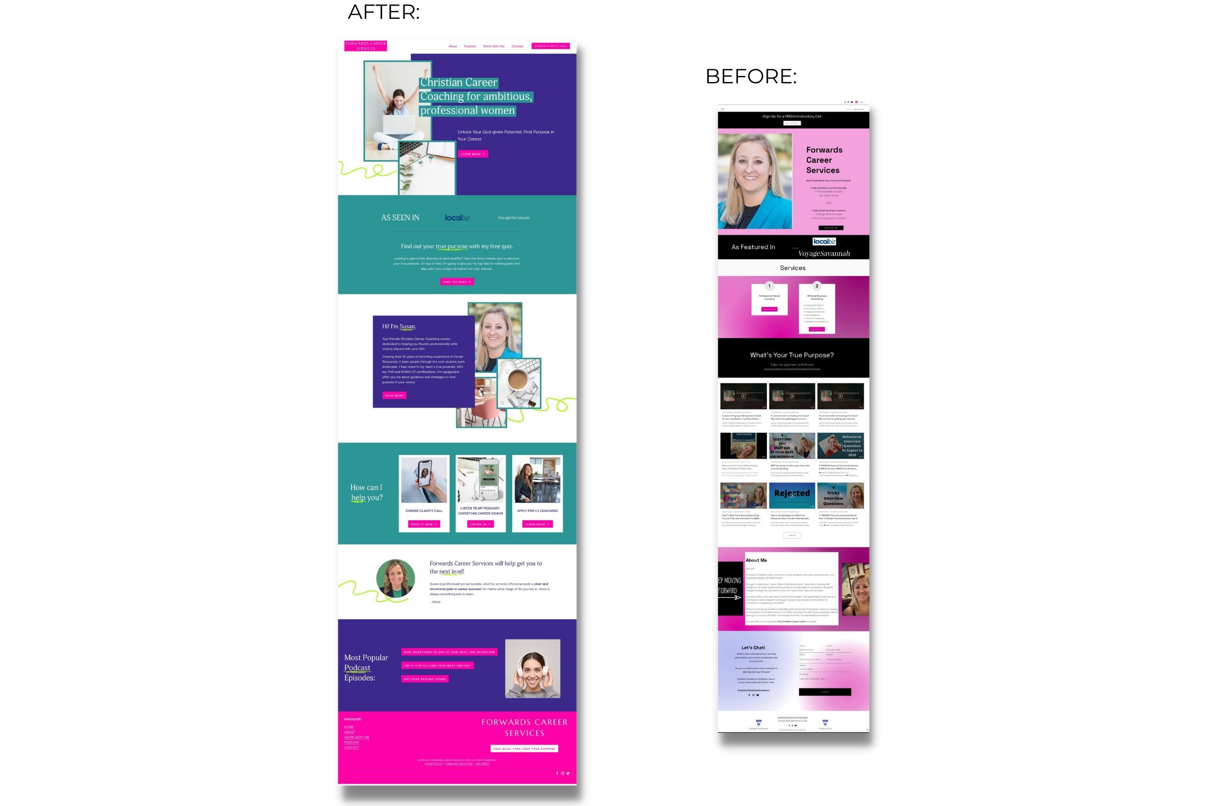
Here's the final homepage design that we came up with for her site:
Here are a few more images and walkthrough videos of Susan’s new site. We’re so excited for her to share it with the world!
Here is Susan’s homepage:
I am so excited about how this site turned out! It’s bright, fun, vibrant… yet also professional and optimistic feeling - just like Susan wanted.
If you’re ready for a website that elevates your credibility and earns you leads and sales while you sleep, check out our DIY website templates that you can customize and launch on your own OR view our template setup package (just like Susan).


